
Introduction to Nepali Fonts
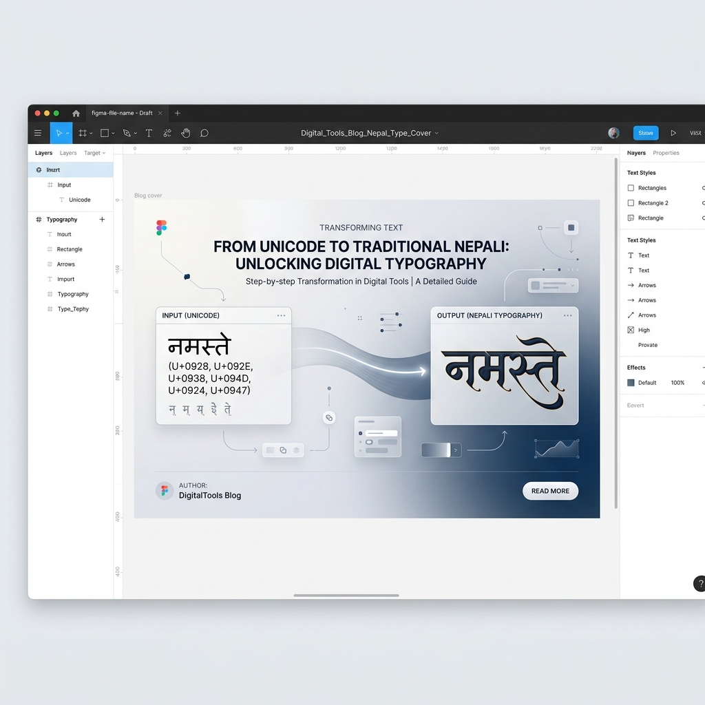
Navigating the complex world of Nepali typography often feels like bridging two entirely different eras of technology. On one side, we have the universal standard championed by the Unicode Consortium, designed to unify global text representation seamlessly across different platforms and operating systems. On the other side, we have the deeply entrenched history of print, characterized by non-standardized formats like Kalimati and Preeti. These formats have been indispensable to the local print industry in Nepal for decades.
For anyone working in content creation, journalism, publishing, or graphic design in Nepal, understanding how to transition between these formats is an absolute necessity. It is not merely a matter of changing the visual style or aesthetic of a document; it's about fundamentally altering the underlying character encoding to ensure proper rendering across different software ecosystems. The shift from traditional printing technologies to modern digital platforms has brought both tremendous opportunities and unique technical hurdles.
Unicode has overwhelmingly successfully solved the problem of displaying Devanagari text on websites, smartphones, tablets, and modern operating systems. Because it assigns a mathematically unique, universally recognized identifier to every single character, vowel modifier, and symbol, words rendered in this standard appear perfectly and consistently across all modern platforms. This unmatched consistency is precisely why practically all new digital content, ranging from casual social media posts and blogs to highly sensitive official government websites and national databases, relies exclusively on this standard.
However, the traditional printing presses, local graphic design workflows, and legacy software that power physical media often operate on vastly different paradigms. Many of these older, tried-and-true systems rely heavily on TrueType Fonts (TTF) mapping visual shapes to ASCII codes, such as the ubiquitous Kalimati. When you attempt to naively paste modern standard text into an older version of Adobe PageMaker, CorelDRAW, or even older Microsoft Office suites, you might be greeted with a confusing string of unreadable symbols, random English letters, or completely jumbled question marks. This disconnect highlights the ongoing need for robust translation utilities.
The History of Nepali Typing Tools
To appreciate why legacy fonts exist, we must step back into the early days of personal computing in Nepal. Before modern operating systems came pre-equipped with comprehensive internationalization support, tying Devanagari script on a standard QWERTY keyboard was an immense challenge. Developers created ingenious workarounds, effectively "tricking" the computer into displaying Nepali characters by mapping them directly over English keys.
This era saw the rise of essential training software that taught a whole generation how to type. A prime example of this historical shift is the legendary Typeshala. As a foundational typing tutor, it introduced students and professionals alike to the non-standard keyboard layouts required to type in these formats. Mastering your WPM (Words Per Minute) on these customized layouts became a highly sought-after resume skill for administrative, journalistic, and design jobs.
The muscle memory developed by using Typeshala is still prevalent among senior typists and copy editors today. Because so many professionals built their careers typing natively in Preeti or similar layouts, transitioning entirely away from them involves unlearning decades of ingrained habits. The persistence of these habits further cements the need for intermediate conversion tools in professional environments.
Why Use Kalimati in the Modern Era?
You might naturally wonder why we don't simply abandon older formats entirely and embrace the global standard exclusively. If the universal standard is superior for data processing and cross-platform compatibility, shouldn't every industry uniformly update their software and workflows to support it? In a theoretically ideal world, the answer is an emphatic yes. But in the practical reality of business, technology, and publishing, transitions are rarely that straightforward or clean.
The Rigid Legacy of Print Infrastructure
Countless printing presses, publishing houses, and design agencies across Nepal still heavily utilize software configurations and hardware that were established over a decade or two ago. Upgrading these entrenched systems requires not only a massive, often prohibitive financial investment in new software licenses and modern hardware, but also involves extensive staff retraining and potentially devastating disruptions to daily operational output. For the vast majority of small to medium-sized publishing entities running on tight margins, it is infinitely more practical and economical to maintain the established status quo that "just works."
Furthermore, legacy fonts like Kalimati boast a highly specific, recognizable aesthetic that has defined Nepali print media. They were originally designed with the intricate, sweeping nuances of Devanagari calligraphy specifically in mind, heavily optimized for the physical printing technologies and low-resolution monitors of their respective eras. Many of the nation's most popular, historically significant newspapers and magazines have painstakingly built their entire visual brand identity around these specific, irreplicable typographic styles. To change the font is to alter the very identity of the publication.
The Challenge: Unicode vs. Preeti/Kalimati
To fundamentally grasp why intricate conversion algorithms are so crucially necessary, we must dive deep into how these two disparate systems handle text processing at a core technical level. The disparity is not merely cosmetic; it is structural.
The universal standard is, at its heart, a purely logical encoding system. It is designed to store the underlying meaning and linguistic identity of a character independently of how it is visually displayed. For example, it assigns a highly specific, permanent code point for the base consonant 'क' (Ka) and an entirely separate, distinct code point for the dependent vowel marker 'ि' (short i). The complex software rendering engine within the operating system or browser is then solely responsible for intelligently combining them dynamically to correctly display the cohesive syllable 'कि'.
In stark contrast, Kalimati and Nepali font variants are strictly visual encoding systems (essentially, they are ingenious but limiting layout hacks built entirely on top of basic ASCII). They rigidly replace standard English letters with specifically drawn Nepali shapes. To type 'कि' in these older systems, a user fundamentally does not type a consonant followed logically by a vowel modifier. Instead, they are forced to type the raw keystrokes that correspond exactly to the visual shapes in a very specific left-to-right order—often bizarrely typing the vowel marker *before* the consonant, because the stroke appears to the left visually.
The Nuanced Complexity of Reverse Conversion
Because of this deeply fundamental architectural difference, converting from a modern logical format back to Kalimati is never a simple one-to-one character substitution or a basic find-and-replace operation. The converter utility must act as a highly intelligent linguistic parser. It must carefully analyze the logical input string, properly understand the intended linguistic syllables and complex consonant clusters, and then calculate and output the exact, unintuitive sequence of English ASCII characters that will trick the older software into visually rendering the same word correctly when the legacy typeface is applied.
This painstaking process involves meticulously handling complex multi-part ligatures (where half-letters dynamically combine with full letters), unique special punctuation symbols, and the wildly varying positional rules of different vowel markers (matras). A simplistic, poorly designed converter will easily misinterpret or break these delicate combinations, resulting in frustrating, unpublishable gibberish text. A high-quality converter, therefore, is an essential tool for maintaining data fidelity across the technological divide.
Other Traditional Formats: Himali, Kantipur, and More
While we focus heavily on Kalimati due to its massive popularity, the landscape of Nepali printing is littered with numerous other legacy fonts.Kantipur, for instance, is another extremely common variant that operates on a nearly identical premise, often preferred by certain specific publishing houses for its slightly different stroke weight and character spacing.
Furthermore, those working with specialized documents might encounter Himali, sometimes referred to colloquially as the Himalayan font style. Each of these typefaces, whether it is Preeti, Kalimati, or Himali, requires similar, though subtly distinct, conversion mapping algorithms. A truly versatile tool suite must account for the minor mapping variations between all these different legacy standards to be genuinely useful to a professional designer.
Step-by-Step Guide to Conversion
Now that we thoroughly understand the complex theoretical background, let's dive deeply into the practical, day-to-day application. Converting your modern text seamlessly back to a legacy format is a highly streamlined and straightforward process when you utilize the right, high-quality utility. Follow these detailed, comprehensive steps to ensure a completely smooth and error-free professional workflow.
Step 1: Thoroughly Prepare Your Source Text
First and foremost, meticulously ensure that your input source text is properly and consistently formatted. It should ideally be free of unintended stray special characters, hidden formatting tags, or mixed-language elements unless absolutely necessary for the final layout. If your raw text contains a haphazard mix of English and Nepali, you must note that the English words will inadvertently also be run through the conversion algorithm, transforming them into bizarre, unintended shapes when the legacy typeface is applied.
Step 2: Access the Professional Conversion Tool
Navigate directly to our dedicated conversion interface. Our robust platform provides a beautifully clean, distraction-free, and highly optimized environment specifically engineered for this complex task. You will immediately notice two primary, clearly labeled text areas: a spacious input field for your modern text and a corresponding output field for the generated ASCII string.
Step 3: Execute the Paste and Convert Operation
Carefully paste your thoroughly prepared text into the designated input box. In the vast majority of cases within our modern interface, the highly optimized conversion algorithms will trigger and process the data automatically in real-time as you type or paste. The output box will almost instantaneously populate with the converted, seemingly nonsensical ASCII text. To the completely untrained eye (or if you simply do not currently have the Kalimati font actively installed on your current operating system), this output might bizarrely look like a completely random string of haphazard English letters, numbers, and random punctuation symbols. Do not panic! This behavior is perfectly normal and entirely expected. This exact, specific string is the precise raw ASCII data that the legacy rendering engine will correctly interpret as beautiful Nepali characters.
Step 4: Copy, Paste, and Apply Formatting
Click the highly visible "Copy to Clipboard" utility button conveniently provided by the web tool interface. Next, seamlessly open your intended target design application (for example, an older version of Adobe InDesign, legacy PageMaker, or traditional MS Word). Carefully paste the raw copied ASCII text directly into your active document canvas. Finally, precisely highlight the newly pasted gibberish text and definitively change the active font family to "Kalimati" or "Preeti" from your desktop application's main font selection dropdown menu. Like magic, the chaotic gibberish string will instantly and flawlessly transform into correctly and beautifully formatted, traditional Nepali text, perfectly ready for professional print layout and final publication.
Similar Global Typography Challenges
It is fascinating to note that this specific type of technological divide is absolutely not unique to Nepal or the Devanagari script. Many different cultures with complex, non-Latin scripts faced incredibly similar immense hurdles during the massive transition to global, unified computing standards.
For instance, developers and publishers in the Middle East faced monumental challenges managing right-to-left scripts. Tools like the Persian converter designed for the IranSystem standard were incredibly popular and absolutely necessary for similar legacy publishing workflows in Iran. Just as Nepali designers rely entirely on bridging the gap between modern inputs and older outputs, Iranian designers relied on IranSystem utilities to maintain their established local printing infrastructure before widespread adoption of better global standards. The underlying concepts of mapping visual hacks over standard ASCII keys were universally employed across the globe to solve early computing limitations.
Troubleshooting Common Professional Issues
Even when utilizing the absolute best, most highly refined conversion tools currently available, very occasional rendering glitches can still happen, particularly when dealing with incredibly highly irregular, archaic words, or extraordinarily rare grammatical symbols. Here is a comprehensive breakdown of the most common frustrating issues you might potentially encounter in a professional setting and exactly how to swiftly and efficiently resolve them to keep your workflow moving.
Issue 1: Intricate Half-Characters Rendering Incorrectly
Sometimes, a complex half-character (often referred to as a "halant" modified consonant) followed rapidly by a standard full character might frustratingly not combine properly in the final desktop design software, even if the web conversion process itself was perfectly accurate. This frustrating anomaly is almost always a deep setting buried within the specific design software itself, completely unrelated to the web converter. Carefully check if your specific design software has any automatic, advanced ligature settings enabled or disabled by default. For these older visual formats, you generally want standard, basic typography settings completely enabled, as the font fundamentally relies entirely on precise, direct character mapping rather than utilizing complex, modern OpenType rendering features.
Issue 2: Missing or Misplaced Vowel Markers (Matras)
If an 'i' or 'ee' vowel marker (matra) bizarrely appears totally detached or floating on the entirely wrong side of a consonant character, it usually means the converter algorithm subtly failed to accurately sequence the highly specific visual keystrokes correctly for that extremely rare specific syllable combination. While our highly refined tool forcefully minimizes this occurrence through thousands of test cases, if it miraculously still occurs in the wild, you can simply and manually correct the specific errant text snippet directly within your design software by manually typing the corresponding English ASCII key that perfectly maps to that specific missing matra.
Profound Implications for Print Media
The vital ability to seamlessly, rapidly, and accurately convert modern standard text back to heavily entrenched legacy fonts is vastly more than just a minor technical convenience; it is, quite literally, a critical, daily lifeline for the massive regional print industry. As the sprawling digital divide rapidly grows ever wider, maintaining a stable, reliable connection between modern digital content generation and traditional physical production is absolutely vital for survival.
Modern journalists and busy copywriters can now happily utilize powerful, ultra-modern tools like predictive mobile typing apps, highly accurate voice dictation software, and massively collaborative real-time cloud editors—all of which operate entirely and natively in the universal standard. They are blessedly no longer forced to tediously memorize complex, unintuitive keyboard layouts like the ones taught by old typing tutor software just to quickly write and file a breaking news article on the go.
Meanwhile, highly skilled layout artists, senior graphic designers, and veteran press operators absolutely do not need to forcibly overhaul their entire established, highly efficient production pipeline. They can continuously receive modern digital text from the writers, rapidly run it through a fast, highly accurate online conversion utility, and seamlessly proceed with their established, highly efficient page layout workflows in software they already deeply know and own. This beautiful, necessary synergy massively maximizes productivity and heavily reduces stressful friction across the entire complex publishing lifecycle.
Conclusion
Converting flawlessly crisp, modern text into significantly older, idiosyncratic formats like Kalimati or Preeti might initially, intuitively seem like a frustrating step completely backward technologically. However, it is an undeniable, highly practical, and inescapable daily requirement for many thousands of dedicated publishing professionals working today. By deeply, fundamentally understanding the core technical differences between modern logical encoding and older visual ASCII mapping, you can easily navigate these seemingly complex daily challenges with supreme confidence and high efficiency.
We sincerely hope this extensive, detailed tutorial has completely demystified the often-confusing process and provided you with a crystal-clear, highly actionable, and foolproof professional guide for your complex, demanding daily publishing needs. The ultimate key to consistent professional success lies squarely in always using a highly reliable, heavily tested converter, preparing your initial input text carefully and methodically, and truly understanding exactly how to correctly apply the older typography within your specific, chosen target design application.
As the broad, ever-shifting technological landscape continues to rapidly evolve over the coming decades, our dedicated suite of professional tools will absolutely adapt and grow alongside it, always ensuring that you consistently have the exact, precise utilities you desperately need to expertly bridge the vast, gaping technical gap between older, established past systems and modern, universal future systems. Happy converting, and may your professional press layouts always be completely error-free and truly pristine!
Frequently Asked Questions (FAQ)
Is this professional conversion tool totally free to use?
Yes, our comprehensive suite of conversion utilities is completely free for all users. We heavily prioritize creating extremely fast, highly secure, and universally accessible web tools for absolutely everyone. All complex data processing happens highly safely and efficiently without ever storing or saving any of your sensitive, private documents or draft articles on our external servers.
Will this specific conversion process negatively affect my overall document formatting?
The conversion algorithm strictly and exclusively changes the raw, underlying character data encoding. It absolutely does not, and cannot, carry over rich text formatting like bolding, italics, underlines, complex table structures, or specialized paragraph spacing from your original source document. You will definitely need to manually re-apply any and all specific rich text styling manually after pasting the newly converted raw text into your professional design software.
Can I reliably use this powerful converter on smaller mobile devices or tablets?
Absolutely! The entire web platform is fully, beautifully responsive and heavily optimized for mobile processing. You can seamlessly convert vast amounts of text from literally any modern smartphone or tablet directly through your standard mobile web browser without downloading any apps. However, it is crucial to note that you generally, practically need a full desktop or laptop computer environment to actually natively install and utilize the older TTF fonts in professional layout software for final printing.
Why does the newly converted output text initially look like bizarre, random English gibberish before I apply the specific font?
Older visual formats essentially operate by strictly mapping very specific Nepali typographical shapes directly to standard, basic English ASCII keyboard characters. The web converter intelligently and mathematically translates the modern, logical inputs into the exact, precise sequence of English letters required to properly trigger those drawn shapes. It will logically only ever visually look like correct Nepali once the specific target typeface is actively applied to that raw, unformatted text string in your target program.