
The "F-Pattern" of Digital Reading
If you take a brilliant piece of writing, remove all the paragraph breaks, and publish it as a single block of text on the internet, it will fail. Nobody will read it. This is because humans do not read on screens the same way they read physical books.
Eye-tracking studies by the Nielsen Norman Group have repeatedly shown that users read digital content in an "F-shaped pattern." They read the headline (the top horizontal bar of the F), scan down the left side of the screen looking for subheadings, read a bit of a subheading that catches their eye (the lower horizontal bar), and then continue scanning down.
If your article is not structured to accommodate this biological scanning behavior, you will have a sky-high bounce rate. Search engines track "dwell time" (how long a user stays on your page). If users leave immediately because the formatting is intimidating, your rankings will plummet. Here is how to structure content for maximum readability.

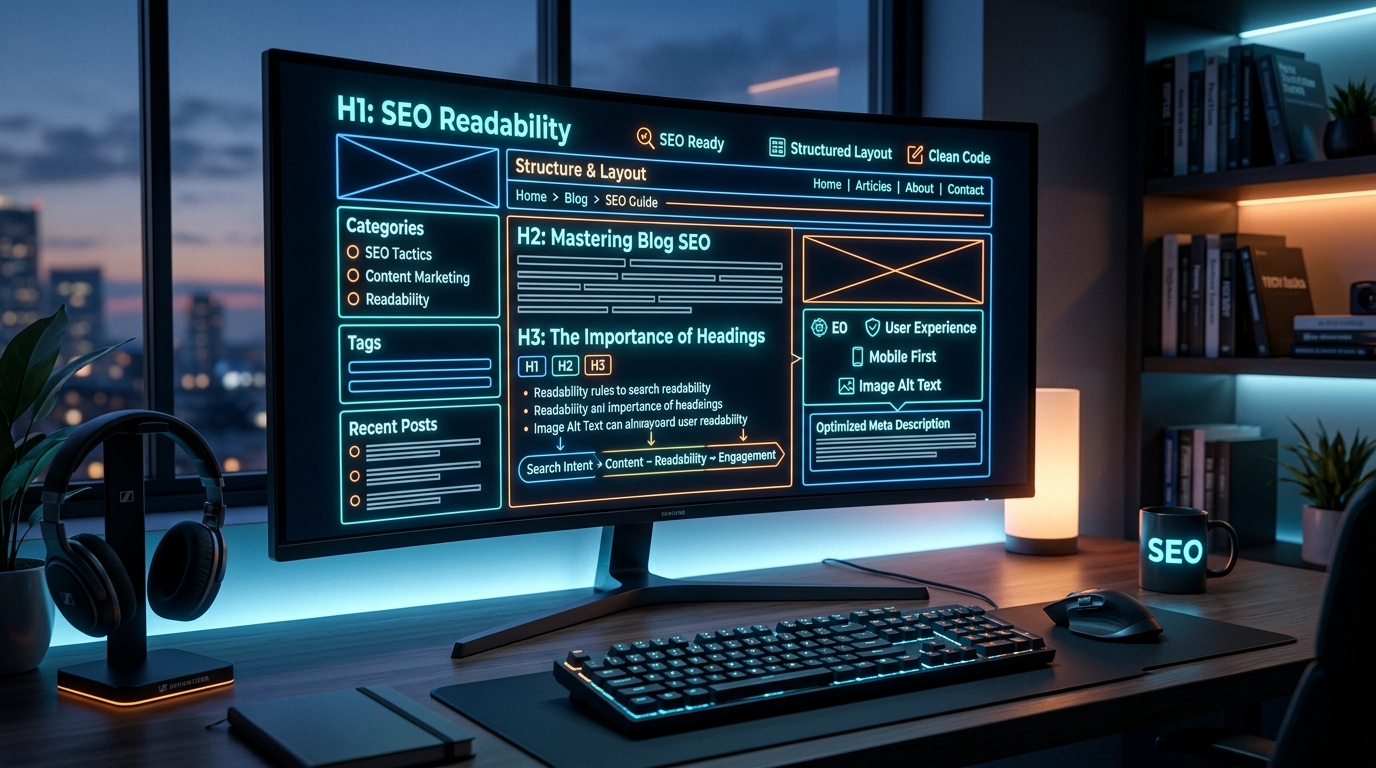
1. The Hierarchy of Headers (H1, H2, H3)
Headers are the skeletal structure of your article. They guide both the human reader and the search engine crawlers through your arguments.
- H1 (Heading 1): This is the title of your post. There should only be one H1 on the entire page. It must contain your primary keyword.
- H2 (Heading 2): These are your main chapters or core arguments. A user should be able to read just your H2s and understand the entire premise of the article.
- H3 (Heading 3): These are sub-points within a specific H2 chapter. Use them to break down complex ideas.
Never use headers just to make text bold or larger. Always use proper semantic HTML tags, as screen readers for the visually impaired rely entirely on this hierarchy to navigate the page.
2. The Power of White Space
In print media, white space is expensive because paper costs money. On the internet, white space is free, yet creators are terrified to use it.
White space (the empty areas between your text and images) gives the reader's eyes a chance to rest. It makes the content look inviting rather than overwhelming. A good rule of thumb for digital writing is to keep your paragraphs extremely short—no more than three to four sentences.
Even a single-sentence paragraph is acceptable and often highly effective for emphasis. When you hit the "Enter" key, you are not just breaking up the text; you are providing psychological relief to the reader.
3. Bullet Points and Bold Text
Remember the F-pattern. Readers are scanning down the left margin looking for something to anchor their attention. Bulleted and numbered lists are the ultimate visual anchors.
Whenever you list three or more items in a sentence, pull them out into a bulleted list. Not only does this create beautiful white space, but it also dramatically increases the chances of winning a Google "Featured Snippet."
Similarly, use bold text strategically. Do not bold entire paragraphs. Instead, bold the core takeaway sentence or the most important metric. If a user is scanning, the bold text acts as a speed bump, forcing them to stop and read that specific line.
4. Passing the "Skimmer Test"
Before you hit publish, run your article through the "Skimmer Test." Scroll rapidly through your article from top to bottom.
Does the page look like a dense, academic textbook? If so, you need more formatting. Are there massive gaps with no visual breaks? Add an image, a blockquote, or a bulleted list. Use tools like a Word Counter to check your estimated reading time; if it exceeds 15 minutes, you absolutely must have a Table of Contents at the top of the page so users can jump to the sections they care about.
Frequently Asked Questions (FAQ)
How many H2s should an article have?
There is no strict rule, but a good practice is to have a subheader (H2 or H3) every 300 words. This ensures the reader never feels lost in a sea of text. For a 1,500-word article, you should aim for at least 4 to 6 main H2 sections.
Does font choice affect readability?
Massively. For digital screens, sans-serif fonts (like Inter, Roboto, or Arial) are generally much easier to read than serif fonts (like Times New Roman). Furthermore, ensure your body text is large enough (usually 16px to 18px) and has adequate line height (around 1.5 to 1.6) so the lines do not bleed into each other.
Can formatting directly improve my SEO?
Yes, both directly and indirectly. Directly, using semantic H2 and H3 tags helps Google understand the structure and topical relevance of your page. Indirectly, good formatting keeps users on your page longer (increased dwell time) and encourages them to read to the end, which are massive positive signals to search algorithms.